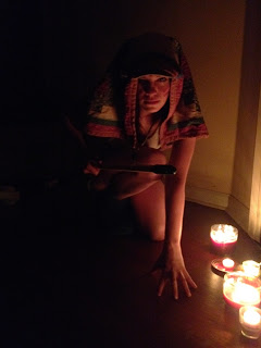
 Still need to fix up some things on this one, but here it is!
Critique went well. Everyone enjoyed the piece itself. I need to focus more on the fire and the anatomy of the body. I also think I need to focus on tangents and realize when I make them!
Still need to fix up some things on this one, but here it is!
Critique went well. Everyone enjoyed the piece itself. I need to focus more on the fire and the anatomy of the body. I also think I need to focus on tangents and realize when I make them!
Thursday, December 5, 2013
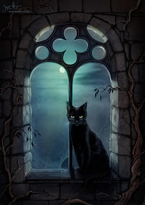
final illustration
Still need to fix up some things on this one, but here it is!
Critique went well. Everyone enjoyed the piece itself. I need to focus more on the fire and the anatomy of the body. I also think I need to focus on tangents and realize when I make them!
Sunday, November 24, 2013
illustration 3 reference
Ok so the story goes, Fernin (short version of name I can actually pronounce!) is the son of Loki( God of mischief pretty much!).
It was foretold that Fernin would help to destroy the world and kill Odin during the time of Raganok, "the end of the world". The gods were scared of Fernin as a puppy and they could only imagine how afraid of him they would be as a full grown dog. Tyr, the god of war, decided to look after him. As he grew he continuously broke the chains the gods put on him. So the gods made a magical ribbon that could hold him. Fernin asked if he could break those ribbons, even though he new he would have no problem. The gods told him yes he more than likely would. But Fernin made the gods promise that one of them had to place their hand in his mouth to test if he was trust worthy. Once he became bound by the ribbon He couldn't break loose. So Tyr was the only one brave enough to stick his hand in Fernins mouth. Fernin bit it off because of the lie. In my image I want to portray the hand of Tyr in Fernin's hand and in the other a spear with the teeth to represent the biting.


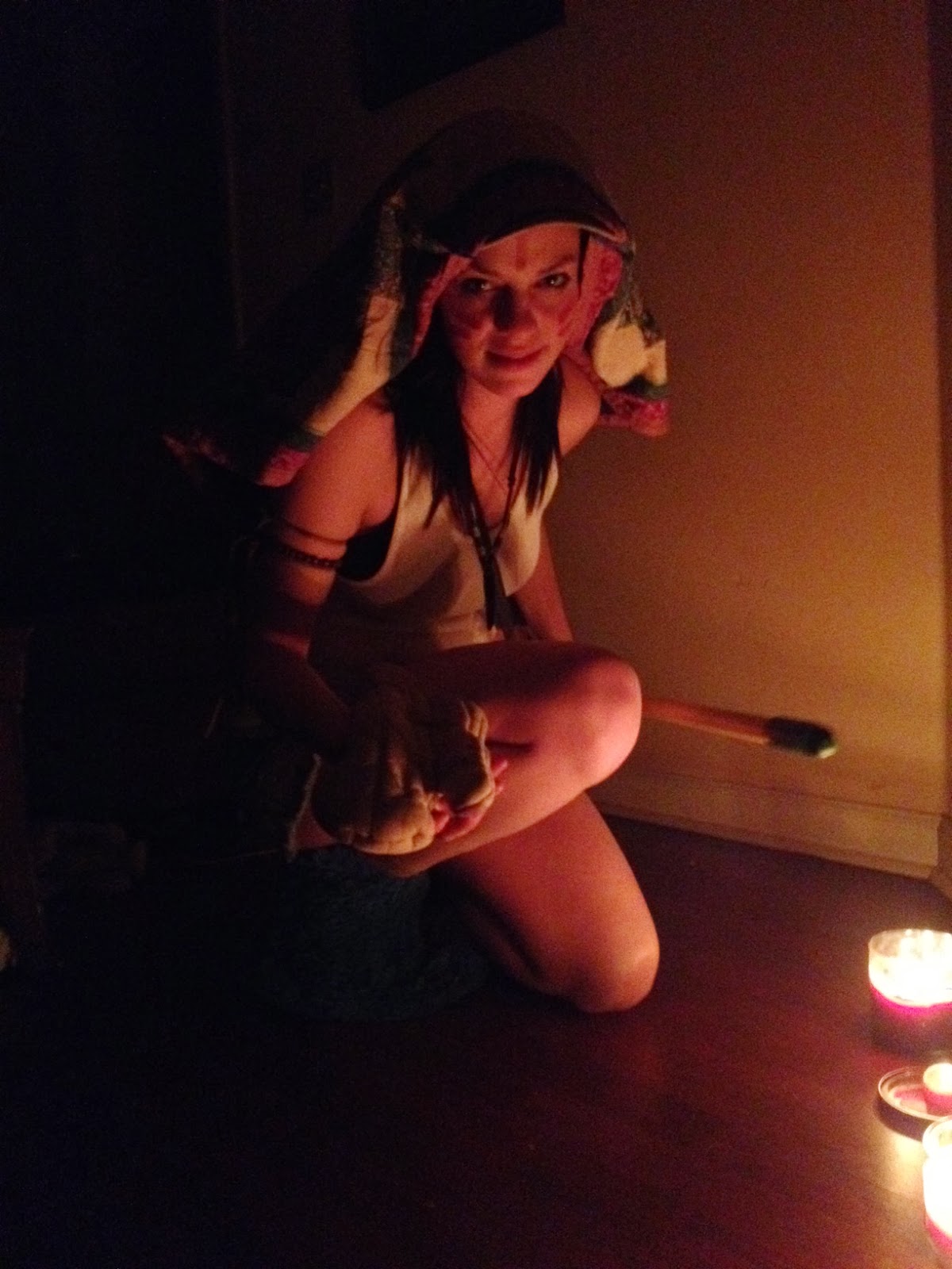
Photo references for final project
Ok so I am leaning towards 6 and 21, 6 isn't a very good shot so i think I am going to go with 21. 21 looks a little more "wolf like" to me as well. I should have taken time out to get into character more lol. 


Sunday, November 17, 2013
communication arts critique

 I worked pretty hard on this piece and the feed back I got back was great but there were a lot of mixed feelings about certain things, like the facial expressions, and the red on the face, but I am just going to work some more on it and hopefully pull out something great!


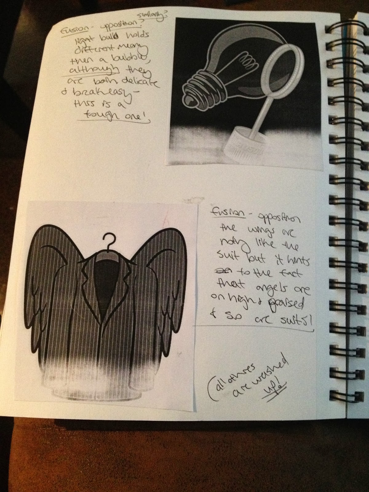
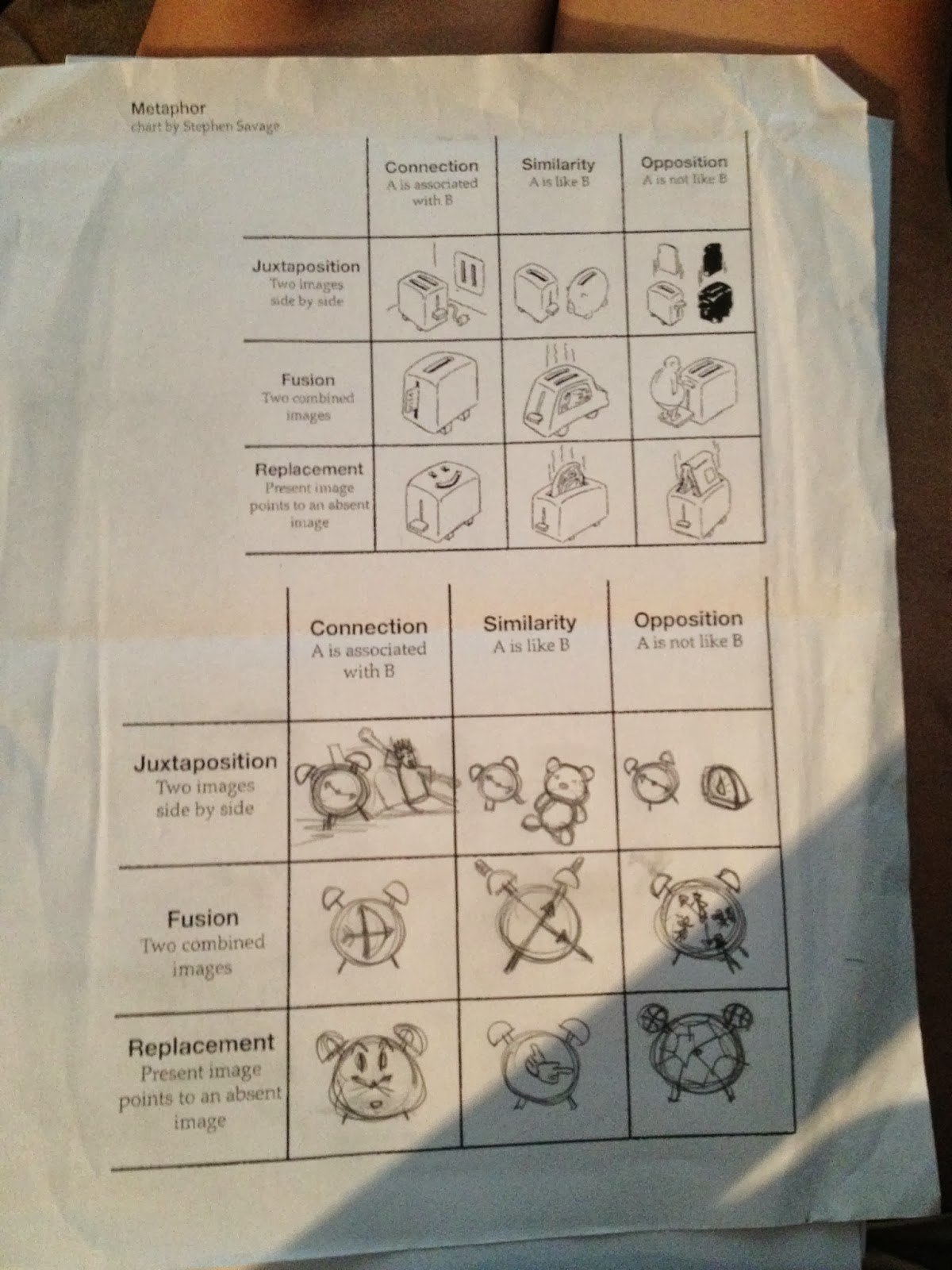
critique on Metaphor

 Overall I really just need to clean it up and think more about my compositions, but luckily everyone liked the deer one, which was my favorite as well!

paper form of the interview with my artist.
(I AM STILL WAITING ON HIS FINAL EMAIL WITH ANSWERS TO MY LAST TEN QUESTIONS)
HERES WHAT I HAVE SO FAR!
Britney Boswell
My artist: Roshan Kurichyanil (Rosh)
Roshan Kurichyanil is a talented young artist that has just done what he loves to do and is accomplishing his goals one step at a time.
Roshan, or Rosh for short, was born and raised in India. He is still there to this day. He attended school to be a journalist, but that dream soon faded when he discovered art and animation at 23.
He worked in animation for about two years after he graduated and then got very bored with it. He says the first moment he knew he wanted to be an artist was the age 25. He enjoyed the preproduction process a lot more then working on the animation itself. I asked him why illustration over animation? He said that it was hard waiting on one person to finish their part before you start on your part. Plus he would much rather create instead of follow the guidelines of someone else. Rosh said he will continue with animation but it won’t be serious until he can create his very own unique to him. He says, “ I will animate when I can animate the entire story.” He goes on to say at the end of the day you have to create a piece of art you shouldn’t be sorry about it later, no matter illustration or animation, it’s always about the story you want to tell or the message you want delivered.
I was really curious about how he got into art and how he developed his style. He said that he watched various videos and started looking into Art History. He carried around his sketchbook EVERYWHERE he went. How he learned and how he recommends everyone to learn and get better is to draw draw draw!
Right now he works as a visualizer for animation and advertising. He also does a lot of freelance work here and there. He does work for children’s books, ads, posters, etc. Then he also does concept art and storyboarding. Once he moved to a cheaper place he began working on a graphic novel.
The first comic he worked on was with two of his close friends. One friend wrote the story; one friend drew the panels and then Rosh colored them all. He says it was a very tedious job because they used no line work or ink base line work. They spent 11 months working on the piece and it ended up being 45 pages all together. While they worked on the novel they took it around to different people and publishers but they were turned down over and over again. They were more interested in Novels and “real works of literature”. Rosh says that they never gave up because they were younger and full of passion! Luckily, they finally found a man that loved their work and had a good bit of money. He started a publishing house and Autopilot, Rosh’s comic, was their first book. This especially great for them because the same year they got published, in 2010, the Indian version of comicon came out. This is a huge step up for India’s art world.
After Autopilot, he began selling a lot of other things after that like Illustrations, paintings, digital prints, and commissioned work. He did a lot of work for people he knew because they gave him freedom to stick with his own style. What artist wouldn’t love that?
Someone inspires every artist, other artists he just met online first inspired Rosh. Then research began and he just found more and more artists to follow. The list he sent is pretty long but just to name a few. Fabio Moon and Gabriel Ba, Mike Mignola, Frank Miller, Carlos Meglia, Humberto Ramos, Skotty Young, Bobby Chiu, Pascal Campion, Ryan Andrews, Sean Gordon Murphy, Milt Kahl, Nicholas Marlette, Sean Galloway, Glen Keane, and a few Indian artists. Although Rosh’s style differs from all of these artists slightly, he draws inspiration from them to make art and to find the drive to make art.
When I asked Rosh the best way to view his artwork, he told me to check out Facebook or his website, his comics are probably not available in the United States. He doesn’t think they have left India. I know the culture there is extremely tight so I asked if he wants to make his comics international or if he just planned on staying in his country and exploring the different scenes there. But Rosh is definitely looking at the bigger picture. He says “ I know the people that understands and appreciates my medium, comics, are everywhere except where I live.” He goes on to say that comics have to go international because stories are pointless until they reach the readers.
STILL WAITING FOR A RESPONSE TO MY LAST SET OF QUESTIONS, THEN I WILL SEND YOU A COMPLETELY FINISHED VERSION OF THIS PAPER.
Thursday, November 7, 2013
Jeremiah Morelli's art work
I LOVE THIS GUYS WORK! He is actually a teacher and teaches art, but he essentially just loves creating art! He is n=in the process of creating a children's book but just can't find a publisher. I love the storybook style of his work. The only way to describe it is MAGICAL!


Sunday, October 6, 2013
illustration presentation assignment
Soooooo I am STILL waiting to hear back from some of the illustrators that I have emailed, I have sent out at least 20 emails! I just did a little more research and sent out emails again, I really hope to get this girl-Marion Arbona. She does children's books and is pretty young. I like her style and I guess I am just letting y'all know I am anxiously awaiting her response. In the mean time I will continue to email other artists though.
Monday, September 30, 2013


reveiw of project1 silohuettes.


Subscribe to:
Posts (Atom)